0-to-1
Product Strategy
Mobile Web (PWA)
Scan Order Pay
A 0-to-1 mobile ordering prototype that helped shape an acquisition decision
In about two months, as the only designer on the project, I took Scan Order Pay from nothing to a working coded prototype, designing every screen and state and partnering with one engineer who built it. It never shipped as its own product, yet it did something rarer: it helped convince leadership that first-party ordering was worth owning, ahead of the Open Tender acquisition in 2023.
Role
Product Designer, the only designer on the project
Team
2 product managers, 2 engineers (prototype build), business stakeholders
Timeline
~2 months, late Q4 2022 to early Q1 2023
Company
Checkmate (formerly ItsaCheckmate)
Platform
Mobile web (PWA)

A running prototype, not a mockup. The Safari browser is the point: an executive could open this on their own phone and order a burger.
At a glance
The problem
Checkmate pulled third-party orders into restaurant POS systems but owned none of the guest relationship. Leadership needed to know what entering first-party ordering would look like, and whether to build it or buy it.
What I did
Reframed a screen-design brief as a strategy question, and built a coded, runnable prototype an executive could open on their own phone. Scoped hard to single-table ordering to protect reliability.
My role
The only designer. Wireframes through visual design to the working prototype, with 2 product managers, 2 engineers, and business stakeholders
Result
Never launched as its own product. Beta tested with 10 restaurant partners, informed leadership's build-versus-buy decision, and preceded the March 2023 Open Tender acquisition.
Checkmate owned restaurant orders, but not the guest
ItsaCheckmate, now Checkmate, pulled third-party orders from DoorDash and Uber Eats straight into a restaurant's POS. Strong position, one gap: the company owned none of the guest relationship.
Leadership wanted to know what entering first-party ordering would look like, and whether to build it or buy it. That open question is the backdrop for everything below, and it is why this project's real output was a decision rather than a screen.
Guests waited. Operators lost upsells.
"During busy shifts, our staff just can't keep up with all the table requests. Sometimes guests get tired of waiting to order or pay."
Restaurant owner, client conversation
I pushed for an argument, not a mockup
The brief could have been read as "design a QR ordering screen." I treated it as "make the opportunity legible to decision makers."
That reframing set the fidelity. Static screens look good in a deck. A coded, clickable flow an executive can run on their own phone lets them reason about it as a business: how it feels to a guest, where it breaks, what it would take to operate. I pushed for the second, and scoped hard to protect it. Single-table ordering only, with group orders, live order status, and open tab documented as later phases rather than half-built.
The scoping was the design decision. A prototype that does four things reliably makes an argument. A prototype that does eight things unevenly makes an excuse.
I mapped every screen, including the payment error state, at low fidelity first.

Low-fidelity wireframes for the full journey, including success and error states.
Designing the failure path alongside the happy path meant the declined-card experience got real attention rather than being retrofitted. With no server standing there to help, the recovery state is the service.
Four decisions that changed the design
Each came out of iteration, not the first pass.
1. A floating cart, so checkout is never out of reach
Problem: A cart button pinned to the top right pulled attention away from the menu and suppressed add-ons.
Decision: Move to a persistent floating View Cart button that follows the guest as they scroll.
Why: Checkout stays one tap away without competing with the items still being browsed, and it removes the round trip to a separate cart screen just to check where you are. This pattern later became common in major delivery apps, though I would not claim to have originated it.
Trade-off: A floating element permanently occupies screen space on a small viewport and can cover the last row of content. I took that because the cost of an invisible cart, abandoned orders and suppressed upsells, is larger than the cost of one obscured menu row.

Cart control iterations, ending in the floating button.
2. Separating the stepper from Add to Order
Problem: The quantity stepper sat right next to Add to Order and was easy to mis-tap. Allergen information was missing entirely.
Decision: Pull the stepper away from the primary action, calm the colour on customization options, and surface allergen and alcohol warnings.
Why: Mis-taps at the moment of commitment cost orders, and allergen information is a safety obligation rather than a nice-to-have. In a self-serve flow there is nobody to ask.
Trade-off: Separating them adds vertical space and pushes the primary action further down the screen. Worth it: a mis-tap at commitment is a lost order, and a missing allergen warning is worse than a lost order.

Item detail iterations. Clearer required choices, allergen warnings, and a safer tap target layout.
3. Editing built into the order summary
Problem: Edit and remove were small text links that were hard to tap.
Decision: Fold remove into the count control and put the running total directly on the checkout button.
Why: Guests correct mistakes right before paying, and friction there is exactly where orders get abandoned. Putting the total on the button means the last thing you read before committing is what you are committing to.
Trade-off: Folding remove into the stepper means removal happens by decrementing to zero, which is less discoverable than an explicit Remove control. I judged that acceptable because the gesture is self-teaching and the alternative was a tap target too small to hit reliably.

Order summary iterations. Editing moved inline and the total moved onto the button.
4. Splitting checkout and payment
Problem: Tip selection and payment on one screen created visual clutter and technical friction with Stripe.
Decision: Separate them into a checkout step for tip and totals, then a dedicated payment step.
Why: With no server in the loop, guests need to see exactly what they are paying before they commit to paying it. The interaction argument and the implementation argument agreed, which is rare enough to act on.
Trade-off: An extra step in the highest-abandonment part of any commerce flow. I took it because ambiguity about the amount is a worse abandonment risk than one more tap, and because the tip decision deserves its own moment rather than competing with card entry.

Checkout and payment iterations, ending in a two-step split.
The flow end to end

The journey mapped end to end, including what happens when a payment fails.

Part one: scan, browse, customize, and add to the order.

Part two: review the order, adjust quantities, and add notes such as allergies.

Part three: check out, tip, pay, and land on a clear success or recovery state.
The three moments that carried the most design weight

The floating cart stays visible as guests scroll.

Customization keeps required choices, add-ons, and allergy notes clear, with live pricing on the button.
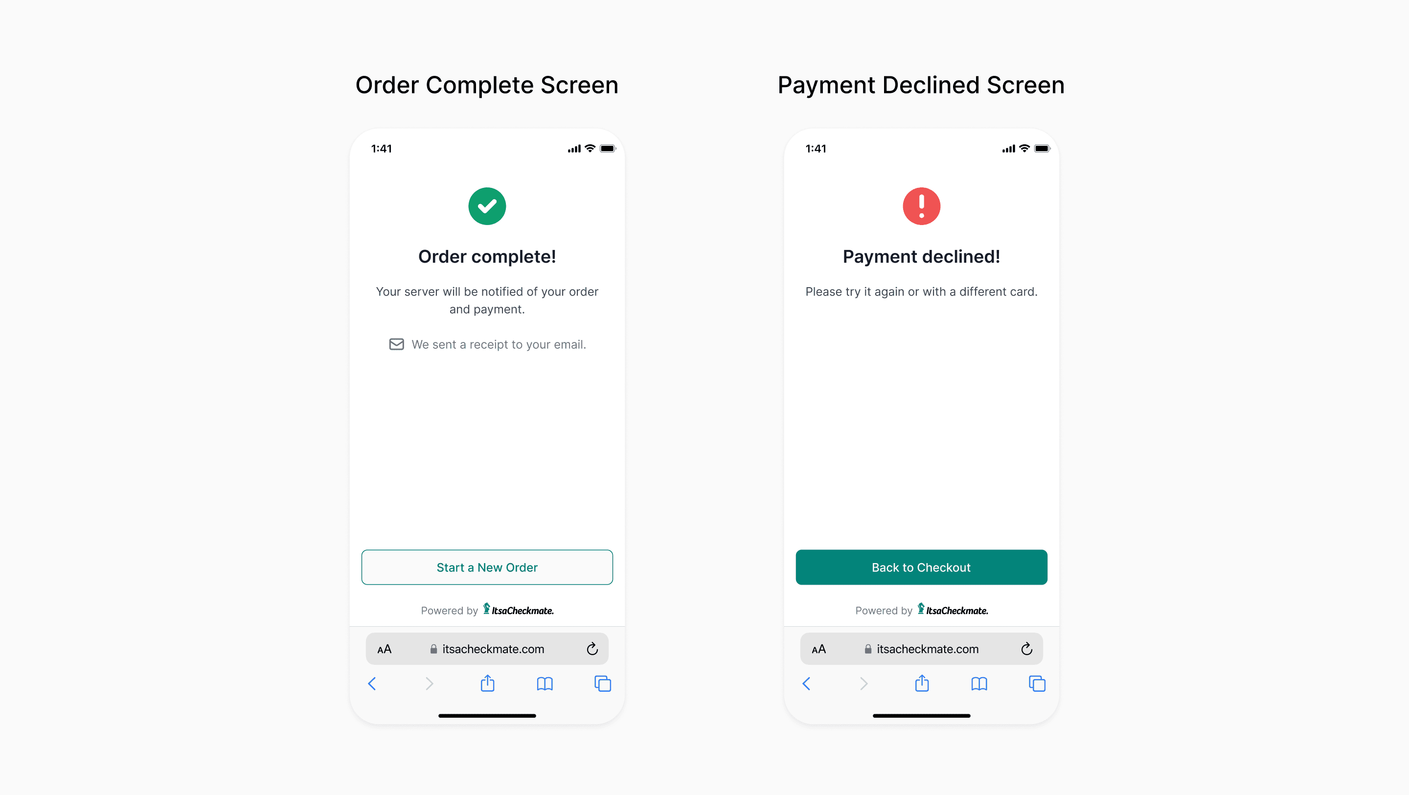
A dedicated confirmation replaces the reassurance a server would normally give, with a clear path back when a card is declined.
What actually happened
Scan Order Pay never launched as its own product. It did something rarer instead.
The pilot proved it worked
After internal testing, the finished prototype went out to ten pilot restaurant partners for beta testing. The feedback that came back, relayed to me through the business team, was uniformly positive. The one snag was a Stripe configuration issue on the backend, which engineering fixed within a week, so it never reflected on the guest experience.
The prototype became a strategic artifact
I presented the prototype to leadership while they were weighing whether to build first-party ordering or buy it. I was told it sharpened what the company actually needed from a first-party product. In March 2023, ItsaCheckmate acquired Open Tender. (Acquisition coverage, Restaurant Business)

March 2023: ItsaCheckmate (now Checkmate) acquired Open Tender, entering the market the prototype had made tangible.
The model held, whoever built it
The product that shipped after the acquisition used the same interaction model: a table-scoped session opened by scanning, browsing and customising in place, a persistent cart, and checkout split from payment. I was not involved in that build.
So I cannot say whether the prototype shaped it, or whether two teams arrived at the same answer for the same reasons. Both readings are worth something. The first would mean the work carried past the project that made it. The second would mean the model was right on the merits, which is the more useful thing to know about a design.
The direction held up
Buying rather than building let the company enter the market immediately, inheriting Open Tender's existing restaurant customers and platform instead of standing up a backend and a client base from scratch. First-party ordering is now core to the business. The company rebranded as Checkmate in 2024 around an expanded ordering platform and raised $10 million to grow it.
Note on evidence
Pilot feedback was qualitative and second-hand: ten partners, no task-time or completion instrumentation, and I have the business team's summary rather than the partners' raw responses. The acquisition timing is public and documented. My prototype's role in the decision is what leadership told me directly, not something I can evidence independently.
What I took from it
A prototype is an argument, not a picture. Pushing for a coded, runnable demo instead of static comps, and getting engineering bought into building one, is what let a design artifact participate in a business decision. I now ask what decision a piece of work needs to unlock, and let that set the fidelity.
Scoping is a design act. Cutting to single-table ordering, and naming what was deferred and why, is what made the concept credible instead of hand-wavy. Restraint bought reliability, and reliability bought trust.
Design the failure path first. Wireframing the payment error state alongside the happy path meant the declined-card experience got real attention. With no server standing there to help, the recovery state is the service.
What I would do differently
The pilot feedback was qualitative, second-hand, and I let it stay that way. I would instrument the next one to capture task time and completion rates alongside the comments, and I would sit in on the sessions rather than receive the summary. Ten partners saying "this is good" is a weaker artifact than ten partners completing an order in a measured median time, and given that the prototype's whole purpose was to inform an investment decision, numbers would have made a stronger argument than enthusiasm did.
No guest ever tested it. The premise of this project is that guests wait too long, and the only people who evaluated the prototype were restaurant operators, at one remove, through the business team. Operators can tell you whether a tool is sellable. They cannot tell you whether someone who has never seen a QR menu will find the floating cart, or trust a payment screen with no staff nearby, or understand that nobody is coming to take the order. Those are the questions the design actually turns on.
In a two-month strategic prototype I accept the constraint, but I should have pushed for a handful of intercept tests in a single pilot restaurant. An afternoon of watching real diners would have told me something none of the rest of the evidence could, and it is the cheapest research on this list.
Want to talk through it?
Happy to walk through the decisions behind this project, or hear about what you're working on.
© 2026 Sean Yu