B2B SaaS
Enterprise
Systems Design
Checkmate Menu Manager
Manage every menu in one place. Push it live everywhere you sell.
Checkmate connects restaurants to their point-of-sale systems and the delivery marketplaces they sell through. Menu Manager is the workspace in the middle, and by 2022 it had stopped scaling with the product around it. I led the redesign end to end, from audit through handoff.
Role
Product Designer, the only designer on Menu Manager
Team
2 product managers, 4 engineers, 1 executive stakeholder
Timeline
2022 to 2023
Company
Checkmate (formerly ItsaCheckmate)
Industry
Enterprise FoodTech, B2B SaaS

Price, platform coverage, and availability, all readable without opening a single item.
At a glance
The problem
Dated, slow, and disorganized. Every edit happened inside a modal that took over the screen, modifier groups nested without limit, and operators routinely lost their place and their work.
What I did
Reorganized the workspace around the objects operators manage, replaced the takeover modal with a persistent side panel, flattened modifier depth into readable summaries, and gave every edit one unambiguous save path.
My role
The only designer on Menu Manager, working alongside 2 product managers, 4 engineers, and 1 executive stakeholder.
Result
Launched in 2023 and still the foundation of Checkmate's menu management product.
Metric
Result
Channel management time
90% reduction
Digital channels managed from one place
10+
Integrations working out of the box
100+
Checkmate-reported product figures. See the note on metrics at the end.
Context
The POS stays the source of truth. Menu Manager is where the restaurant reasons about its menu. And because one edit fans out to every connected channel at once, the cost of a mistake multiplies by the number of platforms a restaurant sells on.

Pull from the POS, manage in one place, push everywhere. One edit reaches every channel a restaurant sells on.
The problem
The old Menu Manager was not missing features. It lacked a structure that could hold the complexity of a real restaurant menu.
The overview optimized for browsing, not working

Built like a menu for diners rather than a workspace for operators. Descriptions hid behind a click.
Price, availability, and platform coverage were small, hidden, or absent. The photograph, which an operator never needs to check, took most of every card.
Editing took over the screen

One X to close, whether you were finished or backing out. Either way the list behind it was gone.
Modifier nesting had no floor and no wayfinding

Forty-three nested groups under a single beverage choice. Every expansion pushed the rest past the bottom edge.
Hierarchy was expressed by nesting expandable containers inside a fixed-height modal. Four levels down there was no breadcrumb, no depth indicator, and no way back except collapsing each layer by hand in the right order.
Operators lost their place, lost track of what they had changed, and lost progress outright. For a restaurant pushing a price change across a dozen channels during a lunch rush, that is not an annoyance. It is revenue.
Research
Operators do not use Menu Manager in isolation. They spend their working day inside delivery marketplace merchant portals, managing the same menus in parallel. So I audited the leading merchant tools to find where the category had already converged.
Jakob's Law
Users spend most of their time on other sites. They expect your interface to work the way everything else they already know works.

Two teams, same answer: a list in the center, detail in a panel that leaves the list visible.
The convergence was the finding. It pointed to two decisions: a scannable list as the primary view, and detail in a side panel rather than an overlay.
That is not house style, it is what the task requires. A list is what you need to scan and compare. A side panel is what lets you edit one item without losing the set it belongs to.
Adopting it let the redesign spend its complexity budget where the real difficulty lives: syncing dozens of POS systems and publishing to many channels at once. In a product where an unfamiliar control during service puts a wrong menu live, novelty is a cost.
What the audit could not tell me
There was no budget, in time or money, for direct operator research. No interviews, no observation on site, no usability testing with the people who actually run these menus during service. What I had was a heuristic audit of the existing product and a competitive audit of the portals operators already use. Everything downstream of that is inference from the product and from how operators describe their work, not from watching them do it.
Four things I could not know:
Whether the category converged correctly, or merely converged. Two teams arriving at the same structure is evidence. It is also how an entire category inherits one team's mistake. A competitive audit cannot tell those apart.
Which of the failures cost operators the most. I ranked them by reasoning about frequency and consequence. Measuring would have produced an order, and I have no way to know whether it would have been mine.
Whether five objects match how operators actually think. The information architecture rests on the claim that operators reason in menus, categories, items, and modifiers rather than in screens. That is drawn from how they talk about the work, which is not the same as testing it.
The operators who never formed a habit. Jakob's Law only helps people who already have one. Anyone new to every tool in the category was invisible to this method.
The constraint is part of why the strategy was right. Being unable to validate a novel design is a strong argument against making one. Borrowing a structure operators already use every day was the lowest-risk option available, and it is a better decision under this constraint than it would have been with a research budget behind it. Had I been able to test, I would have felt free to be more inventive. I could not, so I was not, and in a product where an unfamiliar control during service puts a wrong menu live, that was the right trade.
Decisions
1. Organize around the objects operators manage
What I did: Gave each object its own tab: Overview, Menus, Categories, Items, Modifiers. A modifier group no longer lives four levels inside an item modal. It has an address.
Why: The old IA mirrored the data hierarchy, where a modifier existed only as a child of an item. Operators do not think that way. They think "the milk options are wrong," not "the milk options inside the latte inside the drinks category are wrong."
Trade-off: Five tabs is more surface area than one list, and an operator who only ever edits items now has four tabs they never open. I took that because the alternative, depth, is what the old product died of, and breadth is recoverable in a way depth is not.

Locations and channel assignment, readable before you open anything.

Categories are editable in their own right, not only as headers encountered inside a menu.

One item, one record, however many menus it appears on.

Modifier groups get their own address instead of living four levels inside an item.
2. The list carries what operators scan for
What I did: Demoted photography to a thumbnail and put price, platform coverage, and status on the scanning line. Kept tile view as the alternate, not the default.
Why: Defaults are a point of view. List is default because the primary job is scanning and comparing, not browsing. The operator opening this screen is auditing a hundred items for one wrong price, and a photo does not help them find it.
Trade-off: Menus are visual products, and operators who use the photo to recognise an item lose a cue. Tile view survives for exactly that reason, but it stops being what the product assumes you want.

Photography drops to a thumbnail so the data an operator acts on gets the scanning line.

Kept for reviewing photography before a launch. Not the default, because that is not the daily job.
Defaults are a point of view. List is default because the primary job is scanning and comparing, not browsing.
3. The side panel replaces the takeover modal
What I did: Detail opens in a persistent right-hand panel. The list stays where it was scrolled. The same pattern carries across every object.
Why: Jakob's Law paying off twice. The pattern is already familiar from the portals operators use daily, so there is nothing to learn. And it independently solves the old product's specific failure, where editing an item meant losing sight of everything around it. When the borrowed pattern and the local problem point the same direction, that is the cheapest decision available.
Trade-off: A panel is narrower than a full screen, so dense objects (an item with dozens of modifier groups) have to work in less horizontal space. That constraint is what forced the summary pattern in decision 4, so it turned out to be productive, but it was a real cost at the time.
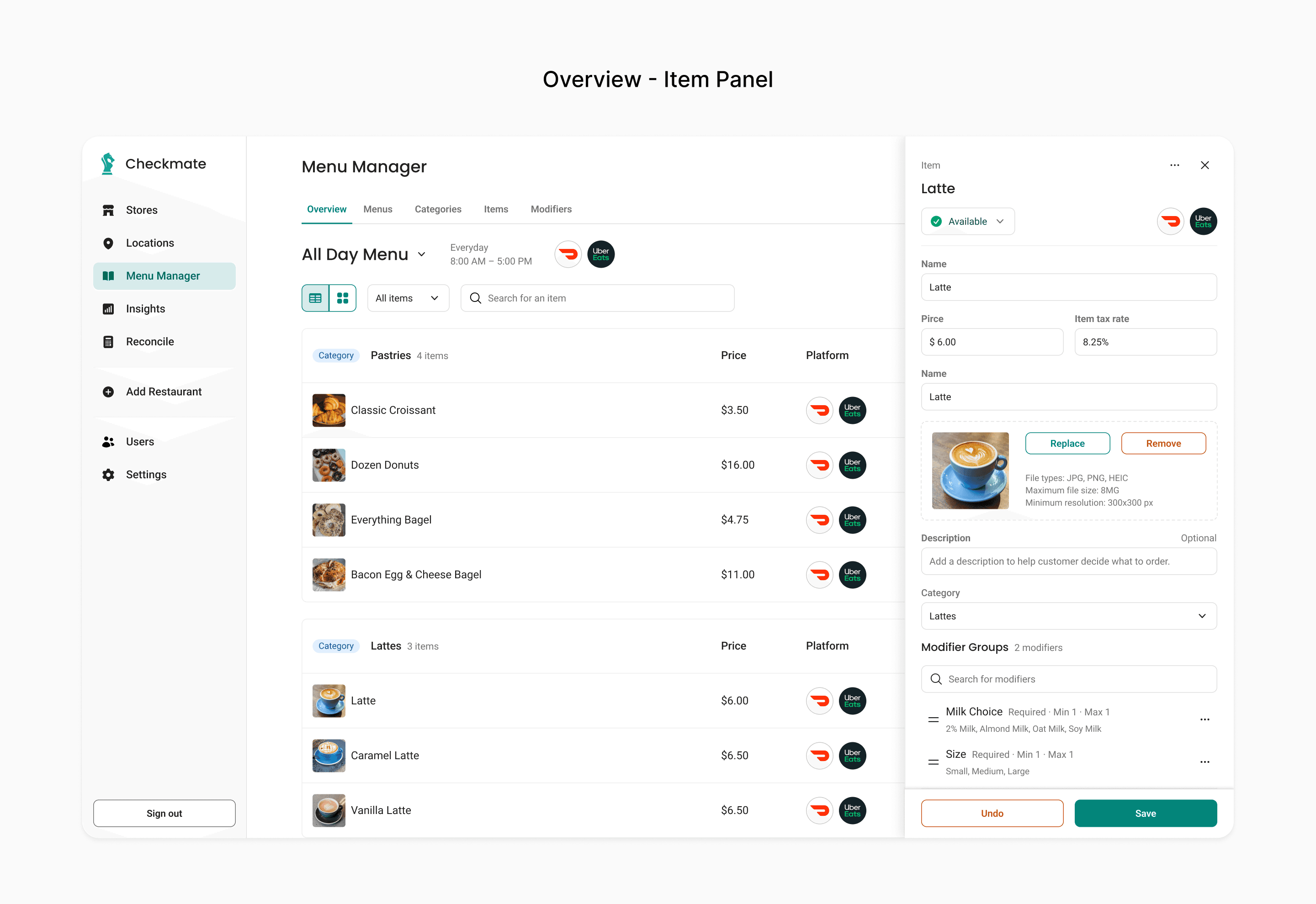
The list stays put and stays scrolled. Closing the panel costs nothing.
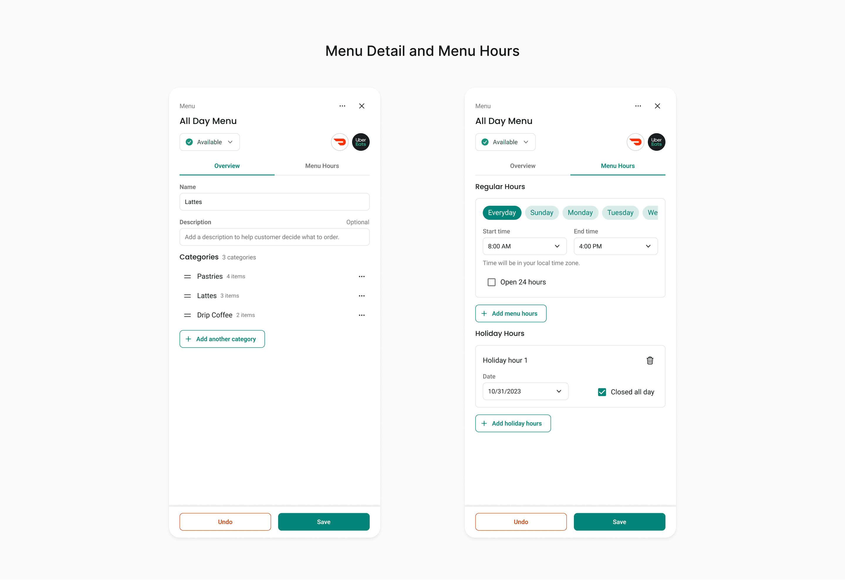
Menus open the same way items do, and their dayparts live with the menu they govern rather than in a settings screen two clicks away.

One panel pattern, every object. Learned once, reused everywhere, down to the save footer.
4. Modifier depth flattened into summaries
What I did: Each modifier group became one row showing its name, its rule, and its values as plain text. Drag handles reorder in place, an overflow menu holds rarer actions, and a search sits above the list for items carrying dozens of groups.
Why: The old design expressed hierarchy by nesting containers, which is why it ran out of room. This one summarises at each level. An operator reads an item's entire modifier structure without expanding anything. Depth still exists in the data. It no longer has to exist in the viewport.
Trade-off: A summary truncates. A group with thirty values cannot show all thirty inline, so at some point the operator still has to open it. I accepted a truncation ceiling because the common case, reading the shape of an item's modifiers, became possible, and the rare case got one click instead of four levels.

Name, rule, and every value on one line. The old design needed four levels of nesting to say this much.
5. One obvious, always-visible save path
What I did: The panel ends in a sticky footer with Undo and Save, visible at any scroll position and scoped to the object in the panel.
Why: The old product had two discard controls with different scopes, and the more destructive one was styled louder. Losing work was routine. Weighting destructive actions to match their blast radius is a safety feature, not polish.
Trade-off: A sticky footer costs vertical space in an already narrow panel. Worth it: closing stops being a decision with consequences.
6. Status is explicit and editable in place
What I did: Named states rather than an ambiguous toggle. "Available" and "Unavailable Indefinitely" read at a glance from the list and change without opening the item.
Why: For an operator eighty-sixing a sold-out item mid-service, that is one click instead of a full edit cycle. This is the most time-critical action in the product and it was buried behind the most expensive interaction.
Trade-off: Named states take more horizontal room than a toggle, and adding states later means revisiting the row layout.
7. Reordering where the order is visible
What I did: Direct manipulation on the list itself, reached from the category overflow menu.
Why: Menu sequence is merchandising. It should be edited where the result is visible, not in a separate ordering dialog where you are reasoning about a list you cannot see.
Trade-off: Direct manipulation is the most legible way to set an order and the least accessible. I shipped it without a non-pointer alternative, which is the miss I discuss at the end.
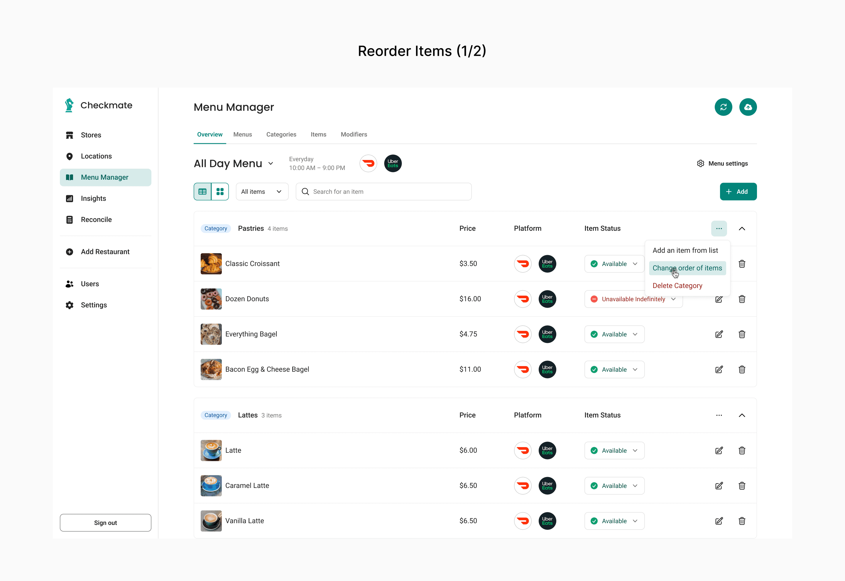
Order is set where order is visible.

Menu sequence is merchandising, so the result stays visible while you decide it.
The impact
Product results reported by Checkmate
90% reduction in channel management time
10+ digital channels managed from one place
100+ integrations working out of the box
Platform and customer results
99% reduction in order errors and a 39% order increase within 60 days, across 700M+ orders processed
30 minutes saved per store per day on menu updates at 16 Handles
22% lift in online order volume at SoBol after centralising its digital menu
What I can speak to directly: the information architecture, the panel and save model, and the modifier structure shipping today are the ones I designed.
Note on metrics
These are Checkmate's published, company-reported figures for its menu management product, not measurements isolated to my design work. Product statistics from Checkmate's product page, platform statistics from its homepage, customer results from its case studies.
Sources: EveryWare solution page · Checkmate homepage · Menu syncing best practices · 16 Handles case study · SoBol case study
What I learned
Depth is a symptom, not the problem. When an interface is running out of room, the question is usually about the model, not the container.
Convention is a feature in operational tools. Where a category has converged, that convergence is evidence. Building on it spends the complexity budget on what is genuinely specific to the product.
Weight destructive actions to match their blast radius. Naming and visual hierarchy are safety features, not polish.
Defaults are a point of view. Every default is an argument about what someone is most likely doing.
What I'd do differently
Push earlier for a shared component and token foundation. The panel, the list row, and the status control repeat across every object. I built Checkmate's first design system in the same period, and the two efforts should have been sequenced deliberately rather than run in parallel. This redesign was the best possible argument for that system, and I did not use it as one.
I shipped a drag-only interaction and did not notice. Reordering works by dragging, and I specified no alternative: no arrow-key reordering, no move-up and move-down pair in the overflow menu, no numeric position field. That fails WCAG 2.1.1 Keyboard, a Level A criterion that has been in the standard since 2008. It is not a subtle miss, and it sits on the screen where an operator decides what a guest sees first.
What makes it instructive is where it happened. I was building Checkmate's first design system in the same period, arguing that accessibility should be fixed at the token level so it is corrected everywhere at once rather than screen by screen. That argument is right about colour and type, and I still make it. But tokens do not reach interaction, and I had no second mechanism for the things they cannot catch. A token system will never tell you that a control has no keyboard path.
The control-level fix is small: keep the drag, and add move up and move down to the row overflow menu. What I would actually change is the process. Any interaction that depends on a pointer gesture needs a stated non-pointer equivalent before it reaches spec, and that check belongs in the handoff template rather than in my memory of it.
Want to talk through it?
Happy to walk through the decisions behind this project, or hear about what you're working on.
© 2026 Sean Yu