AI Chat
Mobile App
Consumer Health
Theta AI Chat
Rebuilding the AI assistant at the center of a consumer health app
Theta Health's AI assistant was the product's core promise and its least usable surface. I redesigned it around a single question: can someone get a trustworthy answer about their own body without fighting the interface? It shipped to the App Store in Q1 2026 and became the pattern the rest of the app was rebuilt against.
Role
Product Designer, sole designer on the feature
Team
1 product manager, 3 engineers, 1 executive stakeholder
Timeline
Q1 2026 · shipped in full to the iOS App Store
Company
Theta Health, a Shanda Group company
Platform
iOS

The redesigned assistant. Every answer carries its source, its reasoning, and a structure that puts urgency first.
At a glance
The problem
Five compounding failures made the product's core feature its least usable one: an exit gesture one mistap from the input, unreadable long answers, a single infinite thread with no way to start over, dead-end history and search, and placeholder copy shipped to production.
What I did
Gave chat the full screen, replaced the infinite thread with discrete sessions, and restructured responses around clinical urgency with the model's reasoning exposed.
My role
Sole designer. I audited, designed, specified, and shipped it, working with 1 PM and 3 engineers.
Result
Task completion rose from 64% to 88%, weekly active chat usage up ~48%, mid-conversation abandonment down 63%, trial-to-paid conversion up ~12%. Product analytics, not a controlled study.
Context
Theta Health is a consumer health app that connects to Mirobody, a wearable that supplies continuous health indicators: sleep, resting heart rate, respiratory rate, blood oxygen, heart rate variability. The AI assistant was meant to be the layer that made all of that legible: ask a question about your own body, get an answer grounded in your own data.
That premise put unusual weight on the interface. A general-purpose assistant that produces a mediocre answer wastes a minute. An assistant that produces a well-grounded answer a user can't parse, or loses when they mistap, or can't be checked against its own sources, fails at the one thing the product exists to do. The design problem was less about layout than about trust: how someone decides whether to believe an answer about their own body.
The problem
I audited the shipped experience before proposing anything. Five failures, compounding.
The tab bar sat under the input field
Reaching for the input, the most common gesture in any chat, was one mistimed tap away from ending the conversation.

The input and the tab bar shared one thumb zone, so the most frequent gesture in the product sat next to the one that ended the conversation.
2. Long answers were unreadable
14px light-weight type on a shifting gradient. It passed contrast on paper and was still tiring to read. Responses arrived as several hundred words of unbroken prose, with the actionable part in paragraph four.

Roughly 400 words with no entry point. The part a person could act on sat in the fourth paragraph.
3. One thread, forever
Every conversation a user had ever had lived in a single continuous thread. There was no way to start a new chat and no way to leave an old one. Sync got slower every week, so the users hitting the wall hardest were the ones using the product most.

The wait was not a one-off. It grew with the thread, so the heaviest users paid the highest cost.
4. History and search were dead ends
A faint "pull down to view history" hint, and a search that returned snippets with no indication of which conversation they came from.

A hint and an icon were the whole model for finding anything you had asked before.

Every result looked the same, and none of them said which conversation it came from.
5. Placeholder copy shipped to production
The attachment menu described Files, Gallery, and Camera with the line "Get a better understanding of where your traffic is coming from." Analytics boilerplate, in a health app, in production. I flagged it in the audit rather than fixing it quietly, because how it got there was a process problem worth naming.
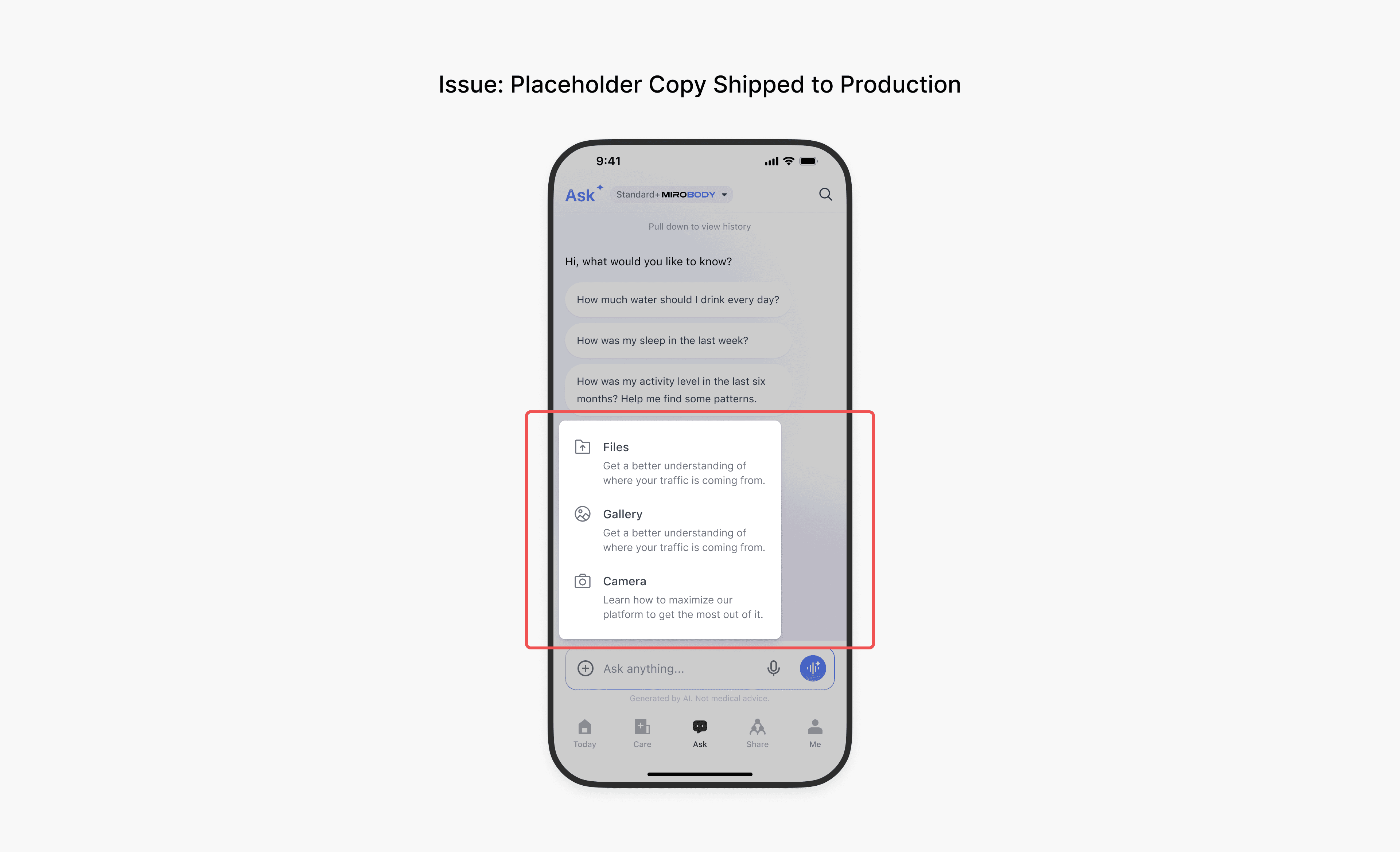
Analytics boilerplate about web traffic, describing a camera, in a health app, in production.
Research
The constraint, first
External participant recruitment wasn't funded. For a consumer health product that's a meaningful gap. The people who use Theta are managing their own health conditions, and I had no access to them.
What I did instead: 3 rounds of moderated usability testing with employees from unrelated teams inside the company, used as naive-user proxies. They had no involvement with the product, no stake in the redesign, and no familiarity with the existing interface, which is what made them useful.
Why internal proxies were worth running anyway
The five failures I'd found in the audit were mostly structural rather than clinical. An exit gesture adjacent to the input, an unreadable wall of type, no way to start a new conversation. You don't need to be managing a health condition to mistap a tab bar or lose your place in four paragraphs of 14px grey text. For that class of problem, a colleague who's never seen the product is a legitimate stand-in.
Three blockers appeared in every round, and each one changed the design.
1. People could not find the key information at a glance. Faced with a long response, people read from the top and worked down rather than scanning, so the part that mattered most was reached last or not at all. When an answer ran past the bottom of the screen, some stopped there without registering that more existed. In a triage hierarchy that is the worst failure available: the line reading seek urgent care now is precisely the line that gets missed.
Two changes came out of it. Responses were restructured so urgency leads, with bold lead-ins and bullets that survive scanning rather than requiring reading. And a downward chevron now appears whenever more of an answer sits below the fold.
2. People could not get back to anything they had asked before. Nobody discovered the pull-down gesture on their own. When people did reach search, the results did not tell them which conversation a snippet had come from, so finding a past answer meant recognising it rather than navigating to it.
This is what turned a sync problem into a structural one. I gave chat explicit sessions, moved history into a visible control in the header rather than a hidden gesture, and added a dedicated history view.
3. People did not know how to start, or which model to pick. The empty state left people unsure what to type at all. In the model sheet, the four options carried no plain-language explanation, so people read all four and closed the sheet without choosing.
Starter prompts were rewritten in the first person, so they read as a problem someone might actually have rather than a demonstration of what the product can do. The model options gained plain-language descriptions, and the Mirobody data permission moved out of that list into a block of its own.
What internal testing could not tell me
This is the honest limit, and it's the part worth stating plainly:
No one in those sessions was worried about their own health. The triage hierarchy (urgent care now, clinician promptly, watch a few days) is designed for someone reading while anxious. A colleague running a scripted task is in the wrong emotional state to test it, and that's the decision I'd most want validated.
Colleagues are more forgiving and more persistent than users. They push through friction a real user abandons: they complete the task because someone is watching, where someone at home closes the app. So a session that ends in success does not mean the design is working, only that it is possible.
They can't evaluate trust. Whether the "Answered by GPT" badge and the reasoning panel actually make someone more willing to act on health advice is the central question of this redesign, and internal testing cannot answer it.
I shipped knowing this. The metrics below are what the redesign produced in production; the internal sessions are what shaped it before it got there.Three blockers appeared in every round, and each one changed the design.
Decisions
1. Chat gets the whole screen
What I did: Removed the tab bar from chat entirely, cut the tab row from five items to three, and moved chat into a persistent floating button on the home screen.
Why: Accidental exit was a structural problem, not a spacing problem. Chat is a focused task, and every conversational AI users already know is full-screen. Widening the tap target would have reduced the error rate; removing the adjacency eliminated it.
Trade-off: Leaving chat costs an extra tap, and a floating button is a non-standard entry point. I took that because losing a conversation mid-thought is worse than a slower path back to a tab you weren't using.

A tab bar is a claim about what a product is for. The old one made five claims of equal weight.

The old home asked a question. The new one shows the day, which is the thing a person opened the app to see.
2. One infinite thread becomes discrete sessions
What I did: Explicit chat sessions, a new-chat control beside history, and a dedicated history view. The floating button always opens a fresh chat.
Why: Fixing sync alone would have left the recall problem in place. Users couldn't find what they'd asked before, so every conversation started from zero, so the assistant never felt like it knew them. The sync spinner was the visible symptom; the missing session model was the cause.
Trade-off: You can't resume yesterday's chat from the home screen, only through history. I chose that because the dominant behaviour is arriving with a new question, and ambiguity about whether you're continuing or starting is worse than one extra tap.

Two controls in the header replaced a gesture nobody found. The tab bar is gone from this screen entirely.
3. The model shows its work, and answers lead with urgency
What I did: Every response carries an "Answered by GPT" badge and a collapsible panel exposing the actual reasoning steps, including which health indicators were retrieved from Mirobody. Generation is interruptible. Responses are restructured into a triage hierarchy: seek urgent care now, contact a clinician promptly, watch over the next few days, do this in the meantime.
Why: In a health context, the order in which information appears is the information. Someone who reads only the first line should still get the part that could matter most. And a user deciding whether to act on health advice needs to know what the advice was based on: whether it read their actual resting heart rate or is answering generically.
Trade-off: Exposing the machinery adds visual load and can reduce perceived confidence; a system that shows its uncertainty looks less authoritative than one that doesn't. I took that because calibrated trust beats blind trust when the subject is your own body. The failure mode I was designing against is someone believing a wrong answer, not someone doubting a right one.

Same words, same length. Only the order and the hierarchy changed, and in health the order is the information.

The stop control is the one people notice. The rating controls gave the team its first labeled signal on model quality.
Also shipped
Consent separated from configuration. The Mirobody health-data permission moved out of the model list into its own block below a divider. Granting access to your health data is a different kind of decision from picking a model, and shouldn't sit in the same list.
A reading pass. Type scale, weight, and background treatment across the response body.
Rewritten starter prompts, in the first person, replacing generic suggestions.
Response feedback controls: copy, thumbs up, thumbs down, share.

Which model to use and whether to read your medical history are different questions. The old sheet asked them in one list.

Three icons and three words. The descriptions were never doing any work, which is why nobody noticed they were wrong.
Impact
Metric
Change
Task completion
64% to 88%
Weekly active chat usage
~48% increase
Mid-conversation abandonment
63% decrease
Trial-to-paid conversion
~12% lift
What I can speak to directly: the session model, the full-screen chat structure, the triage response hierarchy, and the reasoning-panel pattern shipping in the App Store today are the ones I designed and specified.
Note on metrics
All four figures are measured from product analytics over the four weeks after launch, not from a controlled study. There was no holdout group, and the redesign shipped alongside Daily Memo, a symptom and mood logging feature, so I read them as directional rather than precise.
Two of the four I trust more than the others, and the reason is that confound. A new logging feature gives people more reasons to open the app at all, which can lift weekly active chat usage and trial-to-paid conversion on its own. It has no mechanism to change whether someone abandons a conversation halfway through, or finishes the task they opened chat to do. So abandonment and task completion are the two that isolate this redesign: abandonment maps directly to a specific defect we removed, and task completion is a task-level measure rather than an engagement one, which makes it harder to move by accident.
Four weeks is also a short window, short enough that some of the engagement lift could be novelty rather than durable behaviour.
What I learned
In health, information order is information. The triage hierarchy wasn't a formatting decision. Someone scanning the first line of a response is making a decision about their body with whatever they've read so far, and the structure decides what that is.
Calibrated trust beats maximum trust. The instinct with an AI feature is to make it feel authoritative. In a health context the more useful goal is making it checkable. The user should be able to tell what the answer rests on, and to stop it.
A visible symptom is rarely the cause. The sync spinner looked like the history problem. The actual problem was that there was no session model for history to be a history of.
Name the failure before you fix it. I called the readability problem an accessibility failure, and it wasn't. A wrong name sends you to the wrong tool: a contrast checker instead of a type scale. Diagnosis is a design skill, and it is the one that decides whether the rest of the work is aimed at anything.
What I'd do differently
I'd have fought for external participants, or scoped the internal testing more honestly to what it could prove. Three rounds with colleagues validated the structural fixes well. They could not touch the two decisions that most needed it: whether a floating button is discoverable to someone who isn't looking for it, and whether the triage hierarchy holds up for someone reading it while frightened about a symptom. Those are the load-bearing calls in this redesign, and they're the ones I shipped on judgment rather than evidence.
I'd have instrumented the reasoning panel. The "Done thinking" panel is my argument for calibrated trust, and I have no idea how often anyone opens it. If it's rarely, the argument is decorative and I should know that.
Want to talk through it?
Happy to walk through the decisions behind this project, or hear about what you're working on.
© 2026 Sean Yu