Design System
WCAG
Figma
Checkmate Design System
A system three teams adopted because they chose to, not because they were told to
At Checkmate, I designed and shipped the company's first in-house design system from the ground up. Three product teams adopted it voluntarily and estimated median feature build time fell from 4 hours to 1.5. The adoption is what I am proudest of; the efficiency followed from it.
Role
Design System Lead (IC)
Team
2 engineering partners. System adopted by 3 product teams.
Timeline
2022 to 2023
Company
Checkmate (formerly ItsaCheckmate)
Tools
Figma, Design Tokens (JSON), GitHub

One sheet, every foundation and every state. This is what a squad could build from without asking me how it worked.
At a glance
The problem
No shared system. Four squads building the same UI four different ways, with a brand colour that failed WCAG contrast across the entire product.
What I did
Built semantic colour tokens, type and spacing scales, 20+ components, and Figma documentation, with accessibility fixed at the token level rather than screen by screen.
My role
Led the system end to end with 2 engineering partners, without formal authority over the teams I needed to adopt it.
Result
Adopted voluntarily by 3 product teams and used as the foundation for all new feature work. Absorbed a full company rebrand in 2024, after I left, without structural changes.
A platform scaling faster than its UI
Checkmate, known as ItsaCheckmate until its 2024 rebrand, helps restaurant chains including Wendy's, Arby's, and Buffalo Wild Wings unify their online ordering, delivery, and POS systems. By 2022 the platform was processing over $9B in order value across 23,000+ live locations. We had raised a Series B, the team had grown past 300, and we were moving fast.
The problem with moving fast without shared infrastructure is that the cost compounds quietly, until it does not.
The question I set out to answer: how do you build a design system that actually gets used, not just shipped?
Process
I audited before I designed
I prioritized by engineering pain, not by what was interesting to design. Before writing a single token, I audited existing screens to identify which UI patterns were most reused and most inconsistent. The goal was the minimum system that would unlock the maximum leverage.
The audit set the order: foundations first (colour, type, spacing, elevation), then the high-frequency components those foundations would power.
It also surfaced an accessibility problem nobody had named. Colour pairings and font weights across the product were failing WCAG contrast requirements. That gave the system a second mandate: fix accessibility at the token level so it is corrected everywhere, not screen by screen.

The original primary color (#04A89B) failed WCAG AA against white at 2.97:1. The corrected value (#03857A) reaches 4.53:1, clearing AA for body text (4.5:1), large text (3:1), and non-text graphic components (3:1).
Semantic tokens over literal ones

The redesigned token architecture introduced semantic groupings, WCAG-compliant contrast pairings, and a clearer hierarchy for disabled, interactive, and feedback states.
What I deliberately left out
I scoped motion and animation out of v1. Building comprehensive animation tokens before the structural foundations are proven adds complexity without proportional value and slows adoption. The goal was to give teams something they would actually ship with, not a system so complete it never launched.
Legacy screens were also left alone. Retroactively migrating existing UI would have stalled everything, so we drew a line: all new features use the system, all new components extend it.
The trade-off I accepted: the product ran two visual languages simultaneously for an extended period, and motion stayed inconsistent for the whole of v1. Both are recoverable debts. A system that never launches is not.
Foundations

Typography updated from Roboto-only to a Poppins and Roboto pairing, with the display and heading scale recalibrated and font weights adjusted for hierarchy and legibility.

The original spacing model covered three breakpoints with overlapping grid configurations. The new system simplified to desktop and mobile on a consistent 8px base unit, reducing implementation ambiguity.
Components

The button system expanded from a flat, inconsistent set to a structured matrix covering Primary, Secondary, and Tertiary variants across three sizes, three styles, and four icon configurations.

Redesigned text inputs with icon affordances, persistent labels, inline success and error validation, and full state coverage, replacing bare Material-style fields that lacked interaction feedback.

Destructive confirmation moved from green to red. The old system styled "delete forever" exactly like "try it now", and asked "Are you sure?" without saying sure about what.
Documentation
Every component was documented in Figma with variant specs, usage guidance, and state coverage, giving engineers a mapped reference from component to code. I also created a standardized Figma file cover template so every design file carried consistent status labeling and project metadata.

A Figma cover template created to standardize how design work was labeled across the team. Status badges with links to Asana and PRD made file status readable at a glance from the project view.
Foundations, components, and documentation were all built toward a single test: could a squad ship with this without asking me how it worked?
Results
Three product teams adopted the system voluntarily and used it as the foundation for all new feature work. There was no mandate behind it and I had no authority to issue one. That is the outcome the project was designed to produce, and it is the one I would lead with.
It absorbed a full company rebrand in 2024, after I had left. New primary and secondary brand colours meant updating token values, not rebuilding components, and the rest of the system stayed as I had built it. That is the one-to-many model working exactly as intended, tested by the scenario I designed it for and without me there to influence the result.
The contrast remediation is independently checkable. 2.97:1 to 4.53:1, verifiable by anyone against the WCAG formula.
On the efficiency gains. The engineers who adopted the system estimated that core feature build time fell from about four hours to an hour and a half, and that UI-related support tickets dropped noticeably as inconsistent interactions stopped generating confusion for enterprise customers. These are their estimates, not instrumented measurements. We never set a baseline, which I regret and would not repeat.
The speed gains came from replacing ad-hoc component creation with tokenized, pre-built patterns. The ticket reduction reflected something more meaningful: behavioural and layout consistency reduced the friction for enterprise customers managing thousands of locations. The system did not just help us build faster. It helped our customers operate with fewer interruptions.
The clearest proof came after I left. In 2024 the company rebranded from ItsaCheckmate to Checkmate, with a new primary and secondary brand colour. Absorbing it meant updating token values, not rebuilding components, and the rest of the system stayed as I had built it. That is the one-to-many model working exactly as intended, tested by the scenario I had designed it for.
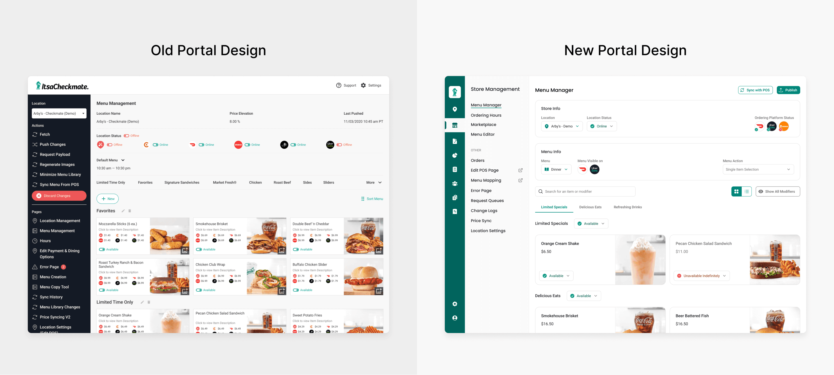
The Checkmate Menu Portal in production, built on the new design system. Navigation components, data tables, status states, and typography are all drawing from the shared library.
I also ran an internal workshop to walk the design and engineering teams through the system, which is where most of the early adoption conversations started.
"As the lead on our design system, he built, organized and maintained our UI elements to ensure designers are using consistent components across all of their design work."
Artawood, Director of UX, Checkmate
What I learned
A design system is a communication challenge wearing a design challenge's clothes. Success is not how many components you ship. It is how deeply the system embeds itself in how a team works.
Treat engineering as a co-owner, not a consumer. That distinction is what turned a design artifact into part of the engineering culture, and it is why adoption needed no mandate.
Fix accessibility at the token level. A contrast failure caught in the tokens is a five-minute fix that corrects the entire product. The same failure caught in review is a six-month remediation project.
Ship the system teams will use, not the system that is complete. Scoping motion out of v1 is the decision I would defend hardest.
What I'd do differently
Involve engineering earlier in token architecture. Not after the naming conventions were set, but during. The adoption curve would have been shallower if the engineers who had to live with those names had shaped them.
Build governance sooner. V1 adoption was strong, but a system without a contribution model is fragile. It becomes the sole designer's responsibility to maintain, which does not scale, and I was the single point of failure for its whole first year.
Want to talk through it?
Happy to walk through the decisions behind this project, or hear about what you're working on.
© 2026 Sean Yu